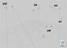
Related to this earlier experiment, I’ve ventured further into the scary world of 3D math and OpenGL, re-doing the 3D visualisation of lamp objects in Blender. There were a few problems with the previous versions which I hope to have addressed in this little project.
The problems I saw in the previous versions:
- They were too dependent on the little yellow center points – when I removed them in the previous experiment, the lamps became almost invisible.
- The ‘stems’ (the vertical dashed line connecting every lamp to the ground plane) created useless visual clutter (why on earth should it be a lamp’s job to tell me which is the Z axis?), and was a potential source of confusion, making normal omnidirectional lamps look the same as hemi or sun lamps pointed vertically downwards.
- There was inadequate visual distinction between lamp types in the 3D View – a hemi lamp looked identical to a sun lamp, and the visual design didn’t really say much about what each lamp did.
- There was inadequate visual communication of other subtle lamp information (only some, such as ‘Dist:’ or ‘Sphere’ settings).
So, I’ve tried to make some improvements:
- Each lamp now has a distinct visual appearance, that hopefully gives a better idea about how the lamp works, i.e. an omnidirectional lamp is represented as a point source, a sun lamp is shown with the typical sun rays, a hemi lamp is shown with arcs representing that the light is coming from a hemisphere direction, not just a single point. I think they all look nicer too 🙂
- More information is displayed – the size of the continuous line circle represents the energy value of the lamp, and a new circle inside the base of the spot lamp cone represents the SpotBlur falloff value (Note: this second circle is not entirely accurate to the rendered image, but it’s moderately close. Maybe someone with knowledge of how this works in the renderer could make it better, at least it’s a nice visual hint at a glance for now).
- The lamps now scale with the objects’ size, and with the view zoom. This means that when you zoom out, you don’t get a meaningless conglomerate of yellow dots at the same size, obscuring everything else. It’s also easy to tell where the lamps are in 3D space in perspective – lamps further away will look smaller. Of course if you do want them to look bigger though, you can just scale them up.
- I’m guessing because they’re drawn as lines, and not using glBitmap commands, these lamps are slightly faster to display on screen, too. On my Powerbook, according to Help->System->Benchmark, the scene shown in the video linked above displays at 284 fps on Blender 2.35 and 298 fps on my development version.
- I’d also like to rename the ‘lamp’ sub-type to ‘omni’ (short for omnidirectional). It’s rather dumb to have a ‘lamp’ sub-type of a ‘lamp’ object.
Now, if only we could modify lamp data (spotsize, spotblur, energy, etc.) directly with transformations in the 3D View, rather than having to use sliders for everything. *sigh*

> Now, if only we could modify lamp data (spotsize,
> spotblur, energy, etc.) directly with
> transformations in the 3D View, rather than having
> to use sliders for everything. *sigh*
This is exactly why I’m making generic input related function (num input, step increments, …) in the new transform code, this way if other people have esoteric cases (this for example or subsurf weight) they can just reuse that to keep the same look and feel.
Martin
Nice, hope to see this on the next version, 2.37, alog with your new interface.
You are doing some nice work.
RCAS
It is very good work! I like your idea: changing of spotsize, energy etc. directly in 3d (in edit mode?) It would be realy very usefull and handy.
> This is exactly why I’m making generic input related function
> (num input, step increments, …) in the new transform code,
Wow, that’s most excellent news! Great work, Martin! 🙂
Cheers, guys
This sort of redesign work should also be done on empties because in their current state they aren’t very useful from a visualization point of view. Great work on this Matt, one thing you should try to tackle is what happens when you scale a lamp.
wow, man this is really wicked.. I could really get into this evolution.. 🙂
>> This sort of redesign work should also be done on empties because in their current state they aren’t very useful from a visualization point of view.
Yeah, it would be nice to have different looking empties for Hooks, and other things like that 🙂
>> one thing you should try to tackle is what happens when you scale a lamp.
Yeah, Ton raised that issue too. The current idea is to prevent lamps being scaled unless it’s actually meaningful (i.e. for an area light). I need help from ‘higher powers’ for that though…
Very very cool Matt!
Are the names going to be billboarded, so that they always face the camera?
Mal
Oh, the names are just text objects I put in the scene to describe what each lamp was, that’s all 🙂
This looks really elegant. Nice work!
I agree, this is awesome. I can’t wait for 2.37. That is, if this and your UI redesign make it in, and I sure do hope that they do.
By the way, thanks for clarifying that weird stem thing. I never knew why it was there, and I always wondered if maybe I wasn’t rotating my lamps properly. I’m guessing now that this is supposed to be like the arrow on the camera, except, well, it doesn’t really do anything worthwhile.