I’ve been working on a project using Blender over the last weeks and during the last few nights menu access has been increasingly frustrating me. Last year I had an idea for how to nicely integrate radial (pie) menus in Blender, and so during some time in the last couple of days I blew the cobwebs off my high school trigonometry and gave it a shot. It’s now mostly implemented and working well so far.
As Blender expands in its capabilities, less and less functionality is accessible directly with a single key press or button click. Keyboard space for new shortcut keys has run out, and most of the recent key additions are poorly structured, since it’s been a matter of finding a key that’s actually available, not one that’s ergonomic or meaningful.
There are ways to help this; customisable shortcut keys and customisable toolbars can help bring back direct access to tools, and an updated and re-thought keyboard layout can help prioritise what’s needed for working in the current age. Giving tools like texture space transformation (T) or split (Y) their own direct key presses worked fine in the 90s when there weren’t that many tools in competition, but these days we have much better tools (such as UV mapping) and more frequently used tools that should be brought to the fore. There is redundancy between popup menus (Ctrl E and K mesh editing menus) and they’re not optimised for ergonomics the same way that Blender’s other earlier hotkeys such as G, R and S are.
Ultimately, although a direct hotkey approach is great when possible and has worked well in the past, it has trouble scaling with an increase in complexity, which is happening in Blender more and more these days. Popup menus are evolving to be a new primary method of accessing tools – just about all of the excellent new mesh modelling tools in Blender 2.42 are found in the ‘Specials’ and ‘Edge Specials’ popup menus. It pays then, to take a look at making these menus as efficient as possible too.
Radial menus are a different method of presenting menu options to just a straight list. They’re more efficient to work with for a few reasons:
- The human ability for memorising an angle direction is much stronger than for remembering a linear distance
- Rather than needing an exact click on a button, one can select items in radial menus based on the angle of the mouse pointer from the start position. This makes the size of the selectable area segment much larger than that of a linear menu item, making it much faster to hit (see Fitt’s law)
- Radial menu items are an equal distance from the mouse pointer, so it doesn’t get successively harder to hit later items, as in a linear menu
Since radial menus rely so heavily on muscle memory, it’s not a good idea to change the position of menu items as new options are added. This can be a problem with auto-flowing radial menus that just divide the available 360A* by the number of available items. In an application like Blender, where new tools are often being developed and added, this would change the menu’s layout each time.
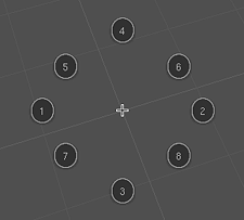
I have designed a layout and order of appearance to use for the first 8 radial menu items. It goes in a seemingly weird pattern, but it’s actually quite logical. It’s designed to be ‘upwards compatible’ for muscle memory so that the menu item locations are fixed and don’t move as new items are added to the menu later on. It also optimises efficiency – a radial menu is best kept symmetrical, with as large an angle between items as possible, so that the hittable areas are as large as possible, and gestural mouse movements can be fast and inexact.
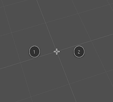
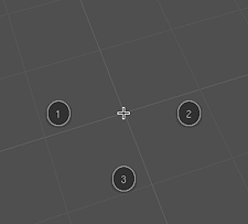
It starts off with two opposite sides for the first two items then joined by the one below for the third (this way, even with three items, the menu seems to still be ‘in order’ reading left to right).


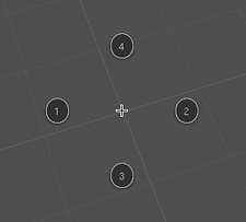
Then the fourth is added to complete the compass directions. From here, it’s just a matter of subdividing the rest of the angles for the last 4 items.


Although the radial menus are best with a maximum of eight items, they should be able to gracefully cope with more, if needed. I haven’t yet figured out the best way to do this, but I’ll probably try an approach of subdividing the 5/6/7/8 positions, or experiment with making a second ‘ring’ on the outside.
References:
- The Design and Evaluation of Marking Menus, Gordon Paul Kurtenbach
- A Comparative Analysis of Pie Menu Performance; by Jack Callahan, Don Hopkins, Mark Weiser, and Ben Shneiderman; Proc. CHI’88 conference, Washington D.C.
- The Design and Implementation of Pie Menus; Don Hopkins; Dr. Dobb’s Journal, Dec. 1991.

I have to admire not only the effort put into the research and implementation but also the presentation. Awesome work, Matt.
I really feel like a VC in the stage where he puts a big case of money on the table. Sadly an imaginative case 🙂
Wow! Great idea! Love it! Id love to see this very soon in blender.
Awesome job!
Great work there! I was going to comment on the problem of adding items but…you thought of that too 🙂
Blender is great, but the most lacking part is really the UI. Hope to see this in the shipping version soon!
Thanks for your comments! Glad to see others think it’s promising too. I’ve still got a few ideas on this left to work through in time – there’s no rush, first 2.42 has to get released 🙂
Wow, it is nice to see all the work you put into solving Blenders UI problesm. I hope to see this soon in blender
Great work, keep at it!
Is there a chance to put a hand on the patches? 🙂
Hi,
I’ll post a patch when I’ve got time to make one 🙂 My blender source right now is ‘contaminated’ with other work too, and I’d need to separate that out first.
cheers
Wow. This is awsome. What a presentation too! I’ve been using modo, which also had pie menus, It really speeds things up once you get used to it.
wow, nice work.
i loved marking-menues, while working with maya. meanwhile also cinema4d and modo have this great feature. it would be a killer-feature, if it was in blender.
…maybe one can individually choose, which function a button has…?
some options that i think that might be worth exploring are (trying to tackle the problem of adding more menu items)
[] using key modifiers (shortcuts) to popup different pie menus.
[] using a layered approach with slightly (skewed | 3d-ized, alpha-blended?) menus
[] showing categories in the pie slices and using the mouse wheel to scroll between options
best,
tom
Impressive! The menus are great for reference, but slow for actual work. This would be useful, and not add bloat.
Tom: Your ideas are interesting, but I think it is important that these menus become as simple as possible. Laying out options in two dimentions is far simpler and easier to remember than a 3d approach.
Bill, I do agree with you, but a common problem in pie-chart menus is their somewhat reduced utility, due to the small amount of information (items) you can put in them.
While my second (little) idea won’t prolly be too useful (despite the oomph factor that shouln’t drive any UI design:)), the other two (real little) ideas shouldn’t add complexity to the solution.
In the end, my own experience says that properly applied Fitts law can really speed up certain UI processes. The best example I can think of is the “infinite area” of the close (the X) button in maximized windows…
best,
tom
Awesome feature 🙂
Only one critic i have is the missing menu-header/title. I think nearly every popup menu in blender has one and I didn’t see them in your cool presentations.
But aside from that it’s just perfect.
Werner
Hoehrer: Right on. That should be added too, also in a way that shows visually that it’s not a selectable option.
cheers!
I have another idea for the problem with more than 8 items in the radial.
The similarity to mouse gestures is obviously, why not use them in the same way?
My suggestion:
Let there be subrings.
If you go to the right, then there pops out a new ring in the moment you stop moving.
From there you could access a new ring with items.
I.e. you hold “W” (as soon as the event handlers allows it) and there pops the ring, where you go right for “subdivide” and up for “subdivide multi”.
You can even stop at subdivide to simple subdivide it.
In this way you can make the standard accessible by stopping after the first choice and you can make a more complex coice if you go for another movement.
Keep on blending.
Joerg
P.S. Sorry for my bad english.
I think a second ring of options would work well.
The hidden version should than know the difference between short and long strokes.
Maya has a popout option for sub items. But I think this is not possible with keeping the options hidden.
Maya also has options made compact. Or ‘prefs’ per option. So “merge selected verteces” is an option with merge at center, merge at last selected, merge at cursor as prefs. A user will probably use the same merge everytime he/she wants to merge.
http://www.nonakassenaar.nl/blender/prefoption.png
Cool idea. Blender’s UI could always use improvements.
I think if you had to have more than eight items, Joerg Luedtke’s idea is the best – it’s actually pretty brilliant.
You don’t want an outer ring because that would obstruct workflow. It would mean you couldn’t just fling your mouse in the right direction anymore, and that’s what so many people love about radial menus.
Great job!
~Peter
Also, I don’t mean to pick or anything, but it seems that the intermediate buttons on the full eight-item menu aren’t properly posititioned? They’re closer to the 1 and 2 than they are to the 3 and 4.
Wow, I really think that would make an imediate workflow improvement! I’m not sure I understand about the alternate ring method, but I am eager to see this implemented in a later build.
Good job!!
Quick mockup with a header/title, a second ring, 16 entries total and still direction-consistent:
http://www.flickr.com/photos/63231715@N00/216845295/
The numbers are not inserted in the outer ring, but you get the idea.
Werner
Hi!
Well, what happened to this idea? I hoped we would see it implemented in v2.43. It really seems to speed things up. So, what went wrong?
Hi Kostas, the end of this post may give you some background on it: http://mke3.net/weblog/blender-243/
what about the patches??? It is possible to try it?
Nice work! (Sorry for my English)
ow!.. nice work.
like Maya or Modo, that’s fantastic!
where I could found the link to download, or isn’t possible yet?
I could not wait to see it in blender soon
Hi guys, sorry for the late reply. Hopefully you and I might be able to see something like this in Blender 2.5.
I’m a big fan of the workflow style you demo’d in the vid for this post. I hope this style of interaction is adopted for 2.5 in all, or some form. Kudos on the great work!
This will be AWESOME!!!
I really….REAAAAALY hope that this can get into 2.5. Man this is one of the single best new additions to the interface if it gets implemented.
Later who knows maybe we can even have content sensitive ones. Like Silo or Cinema4D.
Excellent job and all the best!