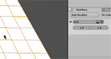
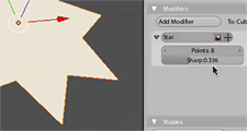
A while ago, I did some experiments that I didn’t really show anyone, a proof of concept for generating non-destructive primitive objects through the modifier stack. One of the things I liked in recent dabblings with 3DS Max is having flexibility and realtime feedback when editing primitive objects, and I thought I’d see if I could make it work in some way in Blender.
The issue of being able to see and tweak the effects of what you’re doing is one of the things that frustrates me most in Blender and I had a bit of a rant about it at last year’s Blender Conference. The topic came up on the bf-funboard list today, so I might as well share it here too:
It’s basically using a modifier at the bottom of the stack to create geometry, which you could then just apply to edit the mesh directly, though that’s not always necessary. This is a bit similar to how Max and Cinema 4D work. When you add an object, you can still manipulate dimensions, resolution, other parameters as a whole. Then if you want to edit it manually, you convert it to an editable mesh with a click.
 |
 |
Above are some screencasts of what I did in Blender. Obviously it’s simple and rough, and if developed further, one could do things to clean it up like disable those generator modifiers from appearing in the menu, change the add object code to apply the generator modifiers automatically, prevent them from being moved up and down the stack, and perhaps add some code that upon pressing Tab, would give you the option to apply that modifier and just convert it to a mesh so you can edit it. In any case, this could serve as some kind of inspiration for something nice in the future…
this test feature looks great. Excellent demo too. I’d love to see it work from the main context (space) menu as you mentioned, but it’s useful from the modifier panel too. I can’t tell from your demo, but having a mouse scroller effect that increases when you Alt-scroll or Ctrl-scrl could increase x,y grid spaces or star points. I love the scroller effect when doing loop cuts, letting you add more cuts instantly. It’s the kind of feedback that makes me say “cool!”
Very cool!
With objects like the plane, having an option to freeze the size ( so additional sections are added within the existing size ) would be cool, similar to how it works in Max.
Also, having all of the modifier panels appearing in the one go initially in a similar fashion would be great ( mentioned somewhere before, eg for creating item with 2 input boxes, showing both of them at the one time ), and having the result shown in real-time would also be an excellent adaption.
Nice work ( as always! )
Mal
Hello,
this is really useful function that I sometimes miss in Blender. I am used to it from Maya and it is rather handy.
JiriH
genius stuff, as usual, also your thoughts on how to improve this concept are great!
Hello
that’s amazing as all your stuff
keep on
Finally! Primitives that can be parameterized interactively! You can’t have a MAX or any other big fish laughing behind your back on such elementary features. I’ve been waiting for this for a looooong time!
Excellent work Matt!
You are coding really nice things. I hope
these things will be integrated into Blender
some day … maybe in 2.44 or 2.50. 🙂
Hi, thanks for your comments!
I’m not sure how easy this would be to actually make practical in Blender right now. One thing that concerns me is the effect of things like the Vertex group buttons – what would they have to operate on… Perhaps they would ask to convert to mesh as well.
Smick, Mal: Yeah I realised after I made the grid one that it would probably be smarter to have both resolution and width/height controls. That way you could progressively refine the mesh without changing the area.
Rather than mouse wheel, we really just need a way to have the darn number fields updating in real time as they are dragged. This lack of real time feedback is due to deep limitations in Blender’s UI code and is one of my biggest annoyances with at the moment. Probably won’t be easy to solve until 2.5, I hope Ton can take a look at it.
From where you got this GUI ?
I really want this, because its looks so cool. 🙂
Fantastic!!!!!
This goes far beyond my DREAMS!
Me too I hope this makes its way to the cvs… I didn’t think someone could do something like that so soon…
really impressive!
I’m a 3dsMax user too and this feature in blender would be welcome… thanks for your tests Matt, hope to see this and other your ideas in the (next?) blender’s versions.
cheers!
Cloudsk!pper: I presume you mean the buttons. It’s pretty much the same as I had in tuhopuu3 many moons ago, but updated in my own tree, with more improvements and adaptations. I’ve never made a patch yet because it’ll take more time to extract it all from the other code I have in there, perhaps I could just upload an entire source tree.. I plan to implement it in Blender 2.5, along with the buttons window cleanup.
@Matt
Thank you! 🙂
Then I need just to wait. ^^
But do you have more Screenshots of it ?
You dont need to post, but it would be very
nice from you. =)
Um, I guess you can see more by checking earlier posts on this site 🙂 But yeah hopefully before too long I can get this stuff out of just my hands.
Matt, it’s great to hear that you are locally running the latest version of Blender, but with the tuhopuu3 UI – I can’t wait to see this in Blender 2.5!
I’d also like to see some current screenshots / movies of it 🙂 Maybe Bart could show them in an article on Blendernation, along with a bit of a story, to show more of the community how Blender should look like soon!
One last thing – have you tried running the “Glass Buttons” patch with your T3 UI, to see what it would look like? A screenshot of both would be very cool!
Mal
No I haven’t, I’m not a big fan of the ‘glass buttons’. It looks quite gaudy to me, and doesn’t have the subtle elegance of Aqua buttons, which are what it seems to be copying. The line through the middle where the text is disrupts readability and creates distracting repeating patterns when the buttons are laid out next together in a grid.
In the work I’ve been doing (well ‘did’ I guess) with buttons, rather than just piling on bling, there was a much greater emphasis on making something that was subtle and could be used unobtrusively, and also on usability itself with the toggle check boxes, differentiation between control types, etc.
I know what you mean about the line – quite a few people seem to be liking the patch though, with a few usability tweaks to have a less prominent line etc, it might be a good option to have in there.
Of course, the T3 UI work you did both looked very professional, but was also highly functional as well.
I had a thought – what OS do compile on? Would you be able to release a binary snapshot of it, for people to try out? As the Glass Buttons patch got a mention on Blendernation ( and on main blender.org as a result ), an article on your T3 UI would be great, and being able to download your current build would be the icing on the cake! ( as well as generating more interest from users to have it in 2.5 )
As always, keep up the great work ( eg Tablet integration )
Oh yes, I like new builds with new functions. 😛
I’ve been wishing for parametric objects in Blender–I found them to be very useful in 3ds Max. I hope this gets included in Blender soon.
Update: I’ve uploaded a patch here if anyone wants to play 🙂 There’s nothing that you don’t see in the videos and of course it’s just as rudimentary, but hey.
http://mke3.net/blender/etc/para_modif_patch.txt
Cool, thanks Matt! =)
I ask ZanQdo, If he can compile it. 🙂
Matt,
I love it! I just posted a note/idea on BlenderNation – Do not want to copy it here – I’d just post the link here if you do not mind.
http://www.blendernation.com/2007/04/14/parametric-objects-in-blender-2/#comment-90779
Cheers
Bruxy
Great concept. I have been thinking of this for a while also. Coming from Maya, I was thinking more along the lines of a node based system. It would work the same way the modifiers do now with the exception that each modifier is a node in a network and each node can output a full mesh that is immediately editable. You could set it up to look and work like the node system does now with materials. You could have an output node that actually outputs the object mesh to the scene. Each node could have various inputs depending upon what the node does.
This would also give you a full work history of the object; as well as, you could add animation at any point in the construction to allow you to use an earlier, simpler mesh to drive the much denser mesh down the node network. A simple example is animating the verices of a cube to animate the SubD modified mesh, this would be similar to a cube lattice modifying a ball. A more complex example would be a much simpler polygonal mesh of a person or character being animated by an armature which animates the much more complex multi-res and sculpted mesh of the character’s body. In this case you could speed-up rigging by having less vertices, you could actually parent the vertices directly to the armature bones themselves.
I know this would be an enormous re-write of the core of Blender, but would be enormously useful to make Blender future flexible and modifiable.
woooow!!
waiting for *D
How do you apply the patch? 🙂 Thanks!