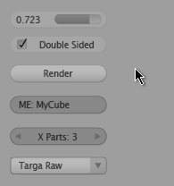
Lately, I’ve been looking back at some of the changes made to Blender’s interface last year for version 2.30, and with the luxury of hindsight, wide testing and feedback, trying to analyse what has worked, what hasn’t, and more importantly, what can be improved or replaced with something better. There has been some discussion over in the forums at blender.org about the GUI controls, which prompted a little experimentation over the weekend in Illustrator, combining parts of the Shaded and Rounded themes, with less emphasis on ‘everything looks like a button’ (pictured right).
Soon, I’ll start coding some working prototypes in OpenGL. Before that, though, there’s some work to do for the 2.34 release, such as getting the Help menu launching web browsers correctly across platforms, porting direct number field editing, and after some code review, porting mouse button selection configuration and phase’s mouse wheel support for number fields.
Very nice looking stuff! A bit resource heavy though? Anyway, wouldn’t mind if this made it in as a GUI drawtype. It looks amazingly slick.
In terms of resources, it’s not really a problem since a) they’re all drawn in graphics hardware (OpenGL) and b) they’re only (well they should be only) updated when they’re absolutely needed, like when a button is clicked or rolled over. The buttons don’t get redrawn when you’re working in navigating the 3D View etc, so it shouldn’t cause a slowdown there. Besides, I don’t think it would require much more code than the current ones 🙂
Cheers
Hi. I love the work that is being done on the UI. I think it is very important that Blender have an attractive and efficient interface. One thing I don’t understand is the reason the checkboxes have to have the button shape. Why not just have a text label next to a small box, as in most operating systems? I think it would help even more to differentiate the different elements. The same could probably be said of the slider, though it’d probably need to be reworked slightly so that the slider itself (i.e. the bar without the label) when either completely empty or full would not be confused with a button. At any rate, the sooner these changes are incorporated the better. Keep up the good work.
Hi Erik,
There are two reasons why the checkbox is more like a ‘button’:
One is that the way these work in blender is that they are all ‘buttons’, just with a different look – in the case of the toggle, the text and the check box are part of the same control, and don’t need differentiation.
To make it like a text-label next to a little box would mean changing the size of the button to be the size of the small box, and then place a text label next to it. This is not an improvement, because it makes the button harder to hit (fitt’s law – the smaller the UI control, the slower to hit with the mouse). Well, in theory you could keep the ‘hittable area’ the same size and just not draw the button outline, but this would not be so good – it would be misleading and confusing, since it would look as if only the small box can be clicked on, even though you could actually click on the text as well.
The other reason is ‘backwards’ compatibility – If implemented in bf-blender, this will probably take the form of an alternate UI theme, hopefully by default. But this also means that the other current themes have to still keep working the same as they do right now, meaning that the general sizes of the buttons should be the same too (see the previous point).
For the slider, well, the text part of a slider *is* like a button – you can click on it to set a value manually. Also due to the general crampedness of the buttons panels in blender, a visual grouping between the numeric value and the slider control itself is really necessary, otherwise they may be confused as separate controls/values, when they’re not.
Cheers and thanks!
Matt
Hi Matt,
I totally forgot that I had ever posted anything, but it’s a good thing I remembered, ’cause you gave quite a lengthy and certainly well thought-out response. So as not to seem ungrateful, I should probably continue the conversation.
I see what you mean about Fitt’s Law and such, and when you mentioned preserving the hittable area but making it invisible, well, you took the words right out of my mouth. I don’t think that’s such a big problem, though, because, at least in OS X, checkboxes can be selected by clicking on their text labels. I think things work this way in Windows and Linux as well, but don’t quote me on that. At any rate, I think users know and expect this to be the case. If that’s true, then like I said, this isn’t so much of a problem. But then, backwards compatibility still is.
I for one say to hell with backwards compatibility (at least of this relatively trivial nature), especially when upgrading is free, but I know the developers probably don’t agree, and that’s fine. So, I guess maybe this kind of change will have to wait until everybody’s switched over to your new UI, and I know they will, to be tweaked further, and I can live with that.
Incidentally, I think Fitt’s law ought to not be the only consideration in UI design. That’s not to say that you didn’t have other considerations, of course, because your UI is obviously very meticulously planned. I just think that, for example, maybe the size of the need only be so big before extra size for increased hittability becomes useless. It’s sort of an asymptotic relationship, I suppose. So, if we assume that the buttons are already “big enough”, as it were, then other considerations ought to come into play. Like, I get the feeling that the lack of spacing between checkboxes can be an issue for some. Since there is no padding, the likelihood that someone will hit the wrong button is increased. This problem could probably be solved if the active area is just the text and checkbox, and the rest of the button is padding.
By the way, when I said that the different elements would be better differentiated, I didn’t mean the checkbox and its label, I meant buttons, checkboxes, sliders, etc., in general.
Finally, I think I’m going to recant my position on the sliders. I think it would be interested if we could somehow combine the sliders and the arrow buttons. I’m not sure exactly what either is called, but, I think you get what I mean. If the sliders could be drawn with the number inside, and controlled as they currently are (that is, they’d look like the arrow buttons, but with the thermometer), then there’d be a good deal of space saving going on. And the arrow buttons could be drawn in the same way, but could be considered as having no predetermined maximum or minimum, and therefore not draw the thermometer.
One more thing… I think you may need to rework the buttons a bit if you adopt the suggestion I’ve made immediately above. Specifically, you mentioned elsewhere that clicking within the thermometer will set the value of the thermometer to the clicked point. Well, if the text is drawn within the thermometer, then users would expect to be able to click to edit the text, as opposed to shift-clicking, which is tedious. So, why not click once to set the thermometer position, and double-click to edit the text. This is similar to Apple’s implementation in Motion.
Anyway, these are just my thoughts. I’d love to hear what else you have to say and continue to contribute my thoughts.
hey, nice UI!
Is there a way to get this on 2.42? a patch maybe?
thanks matt1