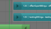
Blender’s inbuilt Video Sequence Editor window is quite powerful, and with the newly integrated wipe transitions and glow filter, is only getting better. But there’s something I’ve been wanting to tackle for a while – the current GUI is old and looking quite dated.
Once again, here’s a mockup out of Illustrator. Hopefully it shouldn’t be too difficult to re-create in OpenGL, but I haven’t taken a look inside the sequence editor’s source code yet! Another one to wait in the pipeline.

You could also put an icon on the strip, like oops.
Hey, that’s a very good idea! Should be relatively easy to do, too.
Looks great!
Blender IS beginning to look just a little tardy or dated in comparison with the eye candy lavished on appl these days.
Keep going matt I like this style a lot :o)
wooops just noticed the date :o) 2 years!
pity it ended up looking flat though…that shading was nice.
Hiya! Yep, it’s old 🙂 And the new one is shaded, it’s just not as strong. Of course the final thing couldn’t turn out the same, there are always limitations once you get it in code. But I’m happy with how it’s turned out – now I think it could work nice extended to other things like NLA. Will give it a try.