November 19th, 2010 .
From time to time I get emails asking about voxel data/volume rendering capabilities in Blender for medical scan data (see this previous post). Today I got one asking for a simple example for using it in 2.5, so I thought I’d re-post it here. It’s using a 512 x 512 x 233 scan of a plastic skull, and the demo file is just loading it up as a density source in a simple scene with ground plane and light. To set it up from scratch, you should be able to follow the same instructions as any tutorial for rendering smoke or other volumes in blender, but change the density source.

Download the demo .blend file here.
Some extra notes:
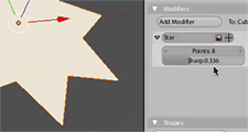
- The main thing to remember is that volume rendering in blender is not really intended for solids, or even medical usage at all – it’s really just a nice side effect. The volume shader in blender is intended for gas/particles like clouds or smoke. Having said that, if you crank the density of the volume right up, you can approach something more solid looking. The above example is using a Density Scale of 50.
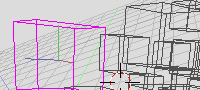
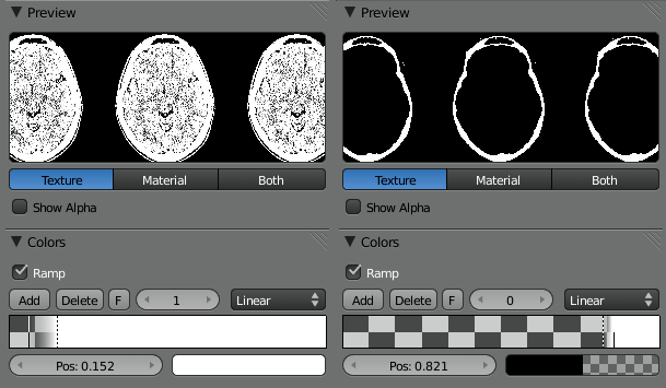
- This plastic skull example was quite easy because I didn’t have to isolate any kind of extra tissue etc. To do that normally you’d have to use the ramp option in the Texture’s Color panel. Here’s an example of a scan of my own head, using the ramp to isolate out the skull (right) from all the flesh (left).
- You may notice on a dense volume like this, the shading looks a bit blocky – this is due to the Light Cache, which speeds up rendering a lot, without too much visual quality loss on most cloud/smoke kinds of volumes. The artifacts do show a bit more clearly with very dense volumes though. You can remedy this by either increasing the Light Cache resolution (using more memory) or turning it off completely (using more CPU).
October 24th, 2009 .
As some of you may have seen, yesterday during the 2009 Blender conference keynote, Ton Roosendaal announced the addition of another full time blender developer: me! Thanks to the support of a very generous anonymous sponsor, I should be able to survive working from home on Blender development for the next few months.
This came about over the last week or two, so it’s still new for me as well. As far as I’m currently aware, the brief for this project is ‘Get Blender 2.5 ready’. So rather than some of the other things I’ve been working on in my own time such as volume rendering, at least in the near term, this project will involve a fair bit of ui work, fixes, tweaks, cleaning up, attacking the 2.5 todo list, documentation – attacking the main things needed to get the 2.5/2.6 work polished to a professional level.
I also hope to be able to provide support to other developers who are working on other tools, to help polish things for 2.5 where they may not have time to do so themselves. This also includes Brecht and Campbell at the Blender Institute who are busy with Durian – I suspect I’ll be taking on some of their grunt work, so they can concentrate on what’s needed for their production. Hopefully this can alleviate some of the ‘blender open project syndrome’, where features are added quickly to fill a specific need for the team, but aren’t entirely well integrated or fleshed out enough to be fully useful for blender users in general.
So that’s the plan as it stands for now. Depending on how soon these tasks can be done, perhaps there will be time for some other things such as working on python integration related work, render api, or also something I think is desperately needed – design and coding work for a re-written shading/material system. But time will tell!
March 5th, 2009 .
I’m currently here with several other Blender developers at Winter Camp 09, organised by the Institute of Network Cultures in Amsterdam.
We’re here to discuss and hopefully make some decisions and consensus on the work we’re doing for Blender 2.5, particularly regarding the user interface and new tool/event system. It’s been really promising so far, and we’re agreeing on a great number of things.
A few links:
October 25th, 2008 .
As much as I’d love to be at the 2008 Blender Conference in Amsterdam, as I have in some years past, it’s quite prohibitive and difficult, especially with work. Luckily, there is a live feed to watch the presentations online. One presentation that I’ve watched in its entirety so far is by William Reynish: The evolution of Blenders User Interface. I’ve met William a few times, and we’ve chatted about these issues a long time ago, and his presentation brilliantly elucidates so many things that I’ve been thinking about, ranting about and very patiently waiting to start working on, for several years. Do yourself a favour and watch it now!
These issues are not theoretical niceties, they’re serious problems that I (and the other people I work with) run up against day by day in our production work. They’re hurdles in Blender’s workflow that not only make Blender slower and clumsier to work in than it could potentially be, but also harder for professional users of other software to come up to speed in Blender quickly, which is important for us too. I’m sure William has come to the same conclusions after his experience working on Big Buck Bunny. Anyway, I want to offer my full support behind William’s presentation, and during the work on Blender 2.5 I’d like to do whatever I can to help make that happen. I hope you all can give these ideas the same support too.
March 29th, 2007 .
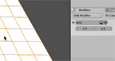
A while ago, I did some experiments that I didn’t really show anyone, a proof of concept for generating non-destructive primitive objects through the modifier stack. One of the things I liked in recent dabblings with 3DS Max is having flexibility and realtime feedback when editing primitive objects, and I thought I’d see if I could make it work in some way in Blender.
The issue of being able to see and tweak the effects of what you’re doing is one of the things that frustrates me most in Blender and I had a bit of a rant about it at last year’s Blender Conference. The topic came up on the bf-funboard list today, so I might as well share it here too:
It’s basically using a modifier at the bottom of the stack to create geometry, which you could then just apply to edit the mesh directly, though that’s not always necessary. This is a bit similar to how Max and Cinema 4D work. When you add an object, you can still manipulate dimensions, resolution, other parameters as a whole. Then if you want to edit it manually, you convert it to an editable mesh with a click.
Above are some screencasts of what I did in Blender. Obviously it’s simple and rough, and if developed further, one could do things to clean it up like disable those generator modifiers from appearing in the menu, change the add object code to apply the generator modifiers automatically, prevent them from being moved up and down the stack, and perhaps add some code that upon pressing Tab, would give you the option to apply that modifier and just convert it to a mesh so you can edit it. In any case, this could serve as some kind of inspiration for something nice in the future…
July 18th, 2006 .
I’m sure most of the people reading this will know already, but Blender 2.42 has finally been released! Hooray! Do go and check out the extensive Release Notes, not just to see the beautiful demo images and movies but to read about the enormous amount of improvements that are in this version, many of which have come directly thanks to the work during the Orange project.
From my own perspective here, once again I’m proud and very happy to have played a tiny part in it’s creation, at Orange and away. My favourite contributions this time round were:
- Floating panel window edge snapping; not an obvious headliner, but makes working with floating panels much nicer
- Video sequence editor visual redesign, following on from this old blog post with mockup. And it only took 2 years to get around to it! 🙂
- Nice lighting setup/checkerboard/hair in the buttons preview render
- Empty display types and size; right now there are only two styles, need ideas for more!
- Cut/Copy/Paste selected text in a button. Should have done it before, but was obviously too lazy
- Three simple composite nodes: Separate RGBA, Separate HSVA, Set Alpha. Lots of fun and I hope to do more. An early patch for Combine RGBA is in the tracker!
- Colour sampler (eyedropper) now in the colour picker popup. It lets you sample a colour from anywhere on the Blender window
There’s also been some fun with the news reports. Blender.org got hit hard by the news article on Digg that some sadistic person submitted there. Also, presumably after reading through the Elephants Dream blog after hearing about the Blender release, one of the many Slashdot Wikipedia ‘enthusiasts’ posted an article mentioning me and linking to my unfortunate experience putting the Elephants Dream DVD menus together. I feel so honoured to have my name up in lights while providing an opportunity for the self-important misanthropes in the Slashdot peanut gallery to delight in some more of their irrelevant ranting. Bravo.
All in all though, a good release. Here’s to the next one, of which I’ll try to keep you all informed of my work towards.
July 7th, 2006 .
I’ve been working on a project using Blender over the last weeks and during the last few nights menu access has been increasingly frustrating me. Last year I had an idea for how to nicely integrate radial (pie) menus in Blender, and so during some time in the last couple of days I blew the cobwebs off my high school trigonometry and gave it a shot. It’s now mostly implemented and working well so far.
As Blender expands in its capabilities, less and less functionality is accessible directly with a single key press or button click. Keyboard space for new shortcut keys has run out, and most of the recent key additions are poorly structured, since it’s been a matter of finding a key that’s actually available, not one that’s ergonomic or meaningful.
There are ways to help this; customisable shortcut keys and customisable toolbars can help bring back direct access to tools, and an updated and re-thought keyboard layout can help prioritise what’s needed for working in the current age. Giving tools like texture space transformation (T) or split (Y) their own direct key presses worked fine in the 90s when there weren’t that many tools in competition, but these days we have much better tools (such as UV mapping) and more frequently used tools that should be brought to the fore. There is redundancy between popup menus (Ctrl E and K mesh editing menus) and they’re not optimised for ergonomics the same way that Blender’s other earlier hotkeys such as G, R and S are.
Ultimately, although a direct hotkey approach is great when possible and has worked well in the past, it has trouble scaling with an increase in complexity, which is happening in Blender more and more these days. Popup menus are evolving to be a new primary method of accessing tools – just about all of the excellent new mesh modelling tools in Blender 2.42 are found in the ‘Specials’ and ‘Edge Specials’ popup menus. It pays then, to take a look at making these menus as efficient as possible too.
Radial menus are a different method of presenting menu options to just a straight list. They’re more efficient to work with for a few reasons:
- The human ability for memorising an angle direction is much stronger than for remembering a linear distance
- Rather than needing an exact click on a button, one can select items in radial menus based on the angle of the mouse pointer from the start position. This makes the size of the selectable area segment much larger than that of a linear menu item, making it much faster to hit (see Fitt’s law)
- Radial menu items are an equal distance from the mouse pointer, so it doesn’t get successively harder to hit later items, as in a linear menu
Since radial menus rely so heavily on muscle memory, it’s not a good idea to change the position of menu items as new options are added. This can be a problem with auto-flowing radial menus that just divide the available 360A* by the number of available items. In an application like Blender, where new tools are often being developed and added, this would change the menu’s layout each time.
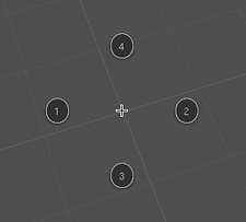
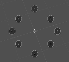
I have designed a layout and order of appearance to use for the first 8 radial menu items. It goes in a seemingly weird pattern, but it’s actually quite logical. It’s designed to be ‘upwards compatible’ for muscle memory so that the menu item locations are fixed and don’t move as new items are added to the menu later on. It also optimises efficiency – a radial menu is best kept symmetrical, with as large an angle between items as possible, so that the hittable areas are as large as possible, and gestural mouse movements can be fast and inexact.
It starts off with two opposite sides for the first two items then joined by the one below for the third (this way, even with three items, the menu seems to still be ‘in order’ reading left to right).
Then the fourth is added to complete the compass directions. From here, it’s just a matter of subdividing the rest of the angles for the last 4 items.
Although the radial menus are best with a maximum of eight items, they should be able to gracefully cope with more, if needed. I haven’t yet figured out the best way to do this, but I’ll probably try an approach of subdividing the 5/6/7/8 positions, or experiment with making a second ‘ring’ on the outside.
References:
December 25th, 2005 .
Just in time for Christmas, Blender 2.40 has been let loose on the internet, leaving a wake of destruction and bringing web servers to their bleeding knees. It’s a ripsnorter of a release, with goodies from Google’s Summer of Code sponsorship like fluid dynamics and re-written inverse kinematics and booleans, along with the usual swag of features and improvements, including all the outstanding work Ton has been doing on the animation system re-write and his work for us at Orange.
I’m very proud to have been able to contribute to this release, not only as crash-test dummy at the studio, but also in a practical sense, being behind many of this release’s interface improvements such as the 3D object visualisation and UI text/number field editing functionality, sequence strip cutting, assorted other fixes and stupid little things like the generated UV test grid. As always, I’m very glad and humbled to have been able to do my little part towards pushing forward Blender’s ever-escalating usability and utility. Onward to the next release!
June 4th, 2005 .
Today, I committed a first revision of code for a user-customisable toolbar to tuhopuu3 (testing Blender version). I overcame my last hurdle of saving the info to the .blend file during the week, so after a very long time in development, here it is.
The toolbar is stored in UserData, meaning it is saved in the default .B.blend file so it’s there when you start tuhopuu3 or load a new file. It is context-sensitive, so it contains different items depending on what mode you’re in. This useful, but also a technical constraint since you don’t want to be executing object mode tools while in edit mode, or vice versa.
Working with it is very simple, just right-click on a menu item in the menus system, or in the toolbar itself for a menu of choices. In the menus: Add to Toolbar adds the clicked-on menu item to the toolbar. In the toolbar, Remove from Toolbar removes the clicked-on item from the toolbar. Wow, who would have guessed! Move Up and Move Down let you re-order the items within the list, and Insert Separator inserts a separator after the clicked-on item. You can give the separator a name, as a nice way to group different tools like view tools, selection tools, interactive tools, whatever you like. Otherwise, you can just leave the name blank to use it as a spacer. And of course, the toolbar items align nicely in their rounded groups ;).
There are a few things that I’d like to try, which are on the todo list:
- Options for using icons, or abbreviated item titles like in Silo (i.e. Subdivide Fractal becomes “SF”)
- Option for horizontal layout, like a pseudo second header
- Putting these custom tools in a popup menu if you don’t want it on screen all the time
The back-end code behind it is probably not a good long term solution, and will likely be made redundant whenever Blender’s fabled internal events system refactoring happens. Perhaps you can consider this implementation a proof of concept, but I continued with this project and committed it for a few reasons:
- Regardless of whether a ‘real’ back-end is in place, we can still use this for user testing and experimenting with the interface and interaction design.
- Seeing this in action might ‘inspire’ whoever’s going to be working on a proper events refactor to get moving on it!
- Whether or not programmers consider the code good, or sustainable, this is working here and now and useful for users, so why not put it in tuhopuu anyway.
May 4th, 2005 .
Here’s a demo video of some experimental Blender code I’ve been working on – the idea has been floating around for a while now. I’m too tired and have no time to write much about it right now, hopefully the video should explain what I’m getting at. Oh, I almost forgot: WIP/experiment/incomplete alert! No requests or complaints just yet, please 🙂
March 2nd, 2005 .
Over the last few days, I’ve committed some code for a time slider to the Tuhopuu Blender testing version, which will hopefully be a big usability boost for animation. I’ve been working on some animation lately myself, so it was a good motivation to polish up this work, which has been sitting around in a partially done state since last year. You can give it a try by picking up a tuhopuu testing build from over at the blender.org forums.
If I could turn back time
Notable features include: (excerpt from the CVS commit logs)
- Useful controls for start/end/current frame, and
buttons to rewind, play and fast forward in the active time area.
The area before the start frame and after the end is now tinted
out slightly.
- The auto key recording is now actually useful 😉
Rather than being a user preference, it’s now a toggle in the
timeline (red record symbol) which can be flicked on and off
quickly, which is really how this is meant to be used. The button
currently works for both object and action keyframes, hopefully it can be extended to other Ipos such as materials in the future.
- Keyframes of the active object are shown as little lines in the
timeline. Yellow lines represent object keys, blue lines represent
action keys
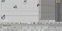
- Markers! Markers are the little triangles you can see in the
screenshot above. Video editors should be very familar with this,
they’re used very often in editing to help time cuts etc, but I don’t
know of any other 3D apps that have this, which is a little
surprising.
Basically, markers are used to mark spots on the timeline, that may
mean something to you, so you can easily find that point later.
They’re useful for timing animation, syncing animation to audio,
and plenty of other things, I’m sure. You can drop a marker on the
current frame by pressing M while the mouse is over the timeline,
or also by pressing M during animation playback (Alt A, play
button, whatever). You can remove a marker from the current frame
with Alt M. There is currently a limit of 99 markers
- Support for naming markers. Ctrl M or Frame->Name Marker opens
a text field where you can give a marker on the current frame a
name, which displays next to the triangle icon.
- Previous / Next Keyframe buttons. These should be pretty self
explanatory – clicking them brings the current frame to the previous
or next keyframe visible on the timeline.
- Hotkeys (S and E) for setting the current frame as the start or
end frame of the animation.
- Right mouse button now cancels animation playback, just like most
other ‘temporary modes’ (same functionality as Esc).
- Timeline now initialises showing frame numbers by default
December 22nd, 2004 .
Related to this earlier experiment, I’ve ventured further into the scary world of 3D math and OpenGL, re-doing the 3D visualisation of lamp objects in Blender. There were a few problems with the previous versions which I hope to have addressed in this little project.
The problems I saw in the previous versions:
- They were too dependent on the little yellow center points – when I removed them in the previous experiment, the lamps became almost invisible.
- The ‘stems’ (the vertical dashed line connecting every lamp to the ground plane) created useless visual clutter (why on earth should it be a lamp’s job to tell me which is the Z axis?), and was a potential source of confusion, making normal omnidirectional lamps look the same as hemi or sun lamps pointed vertically downwards.
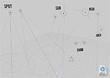
- There was inadequate visual distinction between lamp types in the 3D View – a hemi lamp looked identical to a sun lamp, and the visual design didn’t really say much about what each lamp did.
- There was inadequate visual communication of other subtle lamp information (only some, such as ‘Dist:’ or ‘Sphere’ settings).
So, I’ve tried to make some improvements:
- Each lamp now has a distinct visual appearance, that hopefully gives a better idea about how the lamp works, i.e. an omnidirectional lamp is represented as a point source, a sun lamp is shown with the typical sun rays, a hemi lamp is shown with arcs representing that the light is coming from a hemisphere direction, not just a single point. I think they all look nicer too 🙂
- More information is displayed – the size of the continuous line circle represents the energy value of the lamp, and a new circle inside the base of the spot lamp cone represents the SpotBlur falloff value (Note: this second circle is not entirely accurate to the rendered image, but it’s moderately close. Maybe someone with knowledge of how this works in the renderer could make it better, at least it’s a nice visual hint at a glance for now).
- The lamps now scale with the objects’ size, and with the view zoom. This means that when you zoom out, you don’t get a meaningless conglomerate of yellow dots at the same size, obscuring everything else. It’s also easy to tell where the lamps are in 3D space in perspective – lamps further away will look smaller. Of course if you do want them to look bigger though, you can just scale them up.
- I’m guessing because they’re drawn as lines, and not using glBitmap commands, these lamps are slightly faster to display on screen, too. On my Powerbook, according to Help->System->Benchmark, the scene shown in the video linked above displays at 284 fps on Blender 2.35 and 298 fps on my development version.
- I’d also like to rename the ‘lamp’ sub-type to ‘omni’ (short for omnidirectional). It’s rather dumb to have a ‘lamp’ sub-type of a ‘lamp’ object.
Now, if only we could modify lamp data (spotsize, spotblur, energy, etc.) directly with transformations in the 3D View, rather than having to use sliders for everything. *sigh*
November 16th, 2004 .
One last quick post before I head off to the airport 🙂 At the Blender Conference, a few people saw and were quite positive about the experiments I have been doing with updating Blender’s UI controls, which was nice. The work we’ve been trying to do with the buttons windows is proving to take much longer than estimated, and of course is not in the 2.35 release. I thought it might be a good idea to post a little demo video of how it’s actually working in code, so people who weren’t at the conference can at least see what I’ve been up to on the controls themselves.
The motivation to post this now is that last night I made a little change to the sliders too, after speaking with Wybren ‘WAVK’ van Keulen at the conference – you can now immediately set the position of a slider with one click, just by clicking at the position you want along the line. Dragging on the slider does the same as usual.
A little demo (MPEG4 video, ~1MB)
September 16th, 2004 .
Well, both (!) the proposals I submitted for the Blender Conference 2004 were accepted. Yay! Looks like I’ve got a fair bit of work to do now before October, though. Check out the Conference Program.
July 22nd, 2004 .
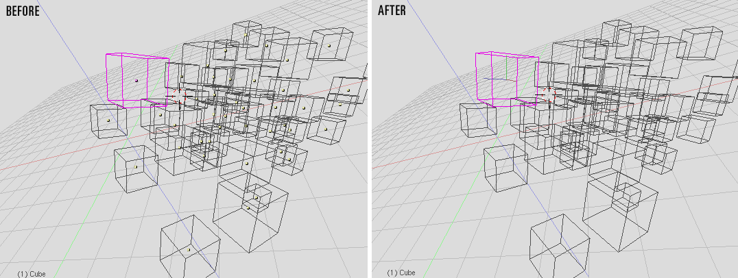
Today at work, I ran into an annoyance I’ve noticed before, trying to make sense of a Blender scene with a huge amount of duplicated objects. The yellow dots that represent the centre/pivot point of objects in Blender were driving me crazy with all the visual noise and distraction on screen, so I came up with what I consider a significant improvement. In my development version, the dots have been completely removed – unselected objects display nothing extra than the objects themselves, and I replaced the centre dots on selected objects with an XYZ axis marker, using red/green/blue axis colours, consistent with the view grid.
Shaded display (click!)
Wireframe display (click!)
Modelling in Edit Mode (click!)
Until recently, this hasn’t been a feasible change to make, since the centre points were the only indication of selected objects in solid or shaded display. However, with Ton Roosendaal’s addition to highlight the edges of selected objects, the centres are no longer as necessary. I’m convinced this is already an improvement in terms of getting rid of the clutter and allowing me to concentrate on my work, but the real value comes when modelling. The XYZ axis marker displays aligned with the object’s local co-ordinates, not global co-ordinates, which is extremely helpful when using axis-constrained transformation (move, rotate, scale). I already owe Martin ‘theeth’ Poirier a lifetime’s supply of free beers for the implementation of this wonderful feature, but one drawback has been that it can be difficult to work out which local axis to constrain to, since the local axes aren’t visually communicated in any way. With this addition, it’s very easy to see, for example, the direction that the red line is pointing in, and quickly hit the G, X, X key sequence to move an object or sub-object along the local X axis. Very fast modelling workflow that takes minimal thought after getting used to the X = Red, Y = Green, Z = Blue convention.
Another interesting side-effect is the extra visualisation of the object’s transformation. While the center dot only represented the object’s location in space, the axes visualise location, rotation and size. This may be increasingly useful information to see, with the addition of the new ‘Align’ mode for transforming object centers only, which will be in Blender 2.34.
On a vaguely related note, I hope you like my new ‘Light’ colour theme 🙂 I found the default was just too dark to be effective in the office I’m working in at the moment – right next to a very bright wall of windows. It also seems to fit in much more nicely with this Mac OS X desktop, too. Colours and themes are also another item ony my list for further investigation before 2.35. Actually, speaking of releases, this will be my fifth post here, with four of them about Blender UI. Yes, there is more to me than Blender, I guess it’s the general state of excitement leading up to what will be a very impressive 2.34 release!
July 21st, 2004 .
Blender’s inbuilt Video Sequence Editor window is quite powerful, and with the newly integrated wipe transitions and glow filter, is only getting better. But there’s something I’ve been wanting to tackle for a while – the current GUI is old and looking quite dated.
Once again, here’s a mockup out of Illustrator. Hopefully it shouldn’t be too difficult to re-create in OpenGL, but I haven’t taken a look inside the sequence editor’s source code yet! Another one to wait in the pipeline.
(click for a larger screenshot)


